


Previously, we’ve looked at some of the changes that are coming with the Unified Interface. We’ve looked at an overview of this feature as well as a quick run through of how the general navigation has changed. For this introduction blog, I’m going to show you what’s changed within the form itself.
Clicking on an Account record, you’ll see the following: 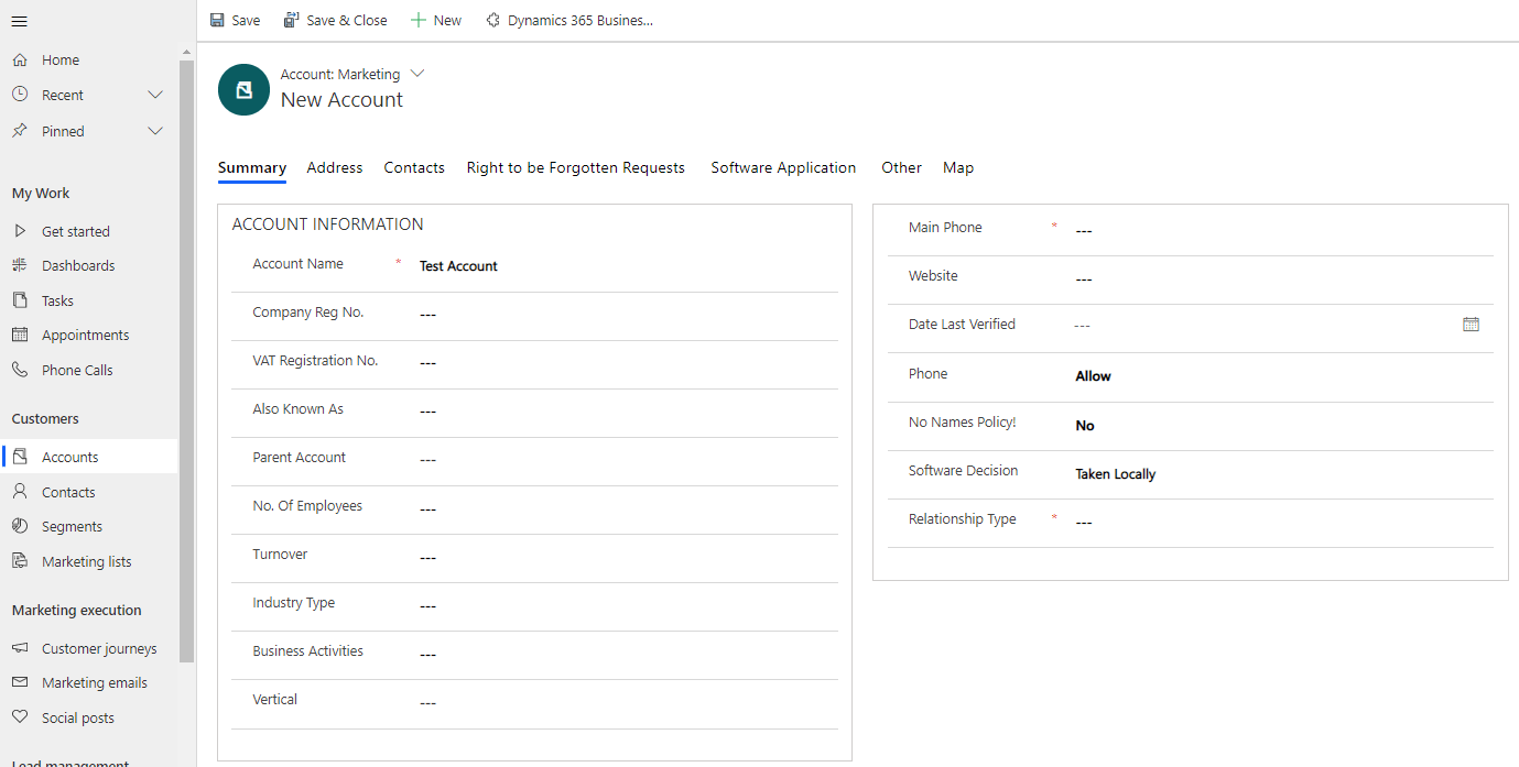
As mentioned previously, the entity navigation as well as recent and pinned items are constantly available. Compare this to the web client (below) and you’ll see that much more of the screen is now usable space (on a large resolution monitor, all that wasted grey space either side of the form is now available).
Again, as we’ve seen with the command bars, it will only hide extra options behind an ellipsis if it runs out of space so more options are available on screen to the user.
You can see that the form selector is still available and the actual form design is still in the hands of the user so this can be laid out as required and will be the same across both interfaces.
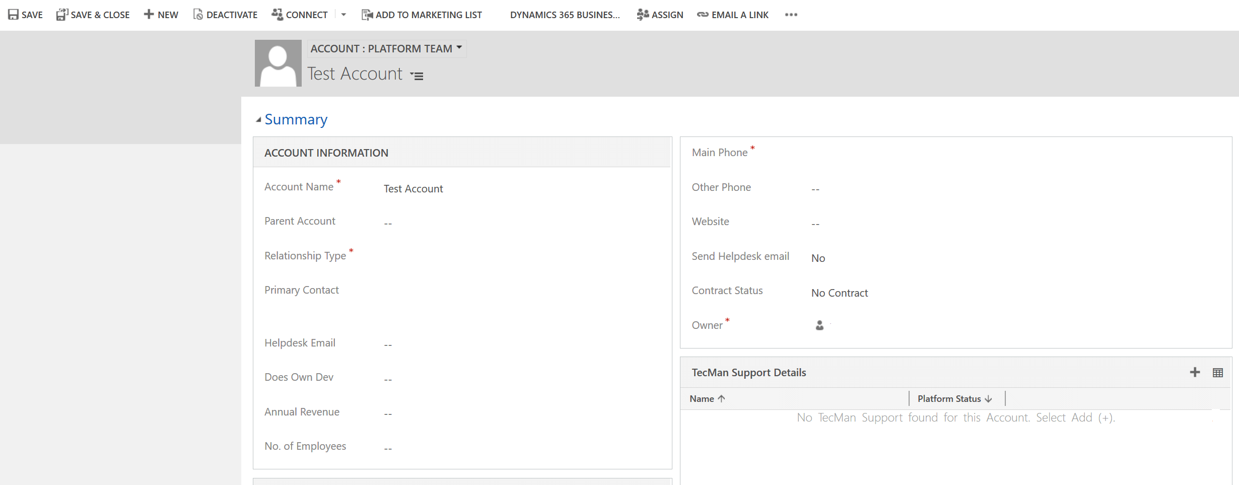
Perhaps the biggest change to how the form displays is the tabs. Back in the days of CRM 4, all the tabs were shown across the top of the form and only one was visible but, when CRM 2011 was released, all the tabs were shown on the form (strictly speaking, they were no longer ‘tabs’). So you were used to seeing them as below:
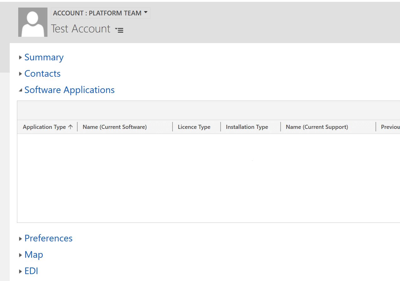
With the Unified Interface, we’ve gone back to tabs as they used to be:
That looks a lot neater to me…
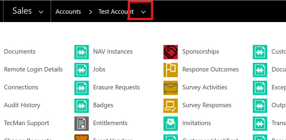
Finally, I want to point out on the forms concerns the ‘related’ information. In the web client, if you wanted to look at the related entities, you accessed these via the drop down link at the top of the page:
This has now moved into the ‘Related’ tab link in the Unified Interface:
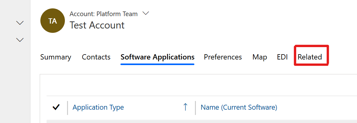
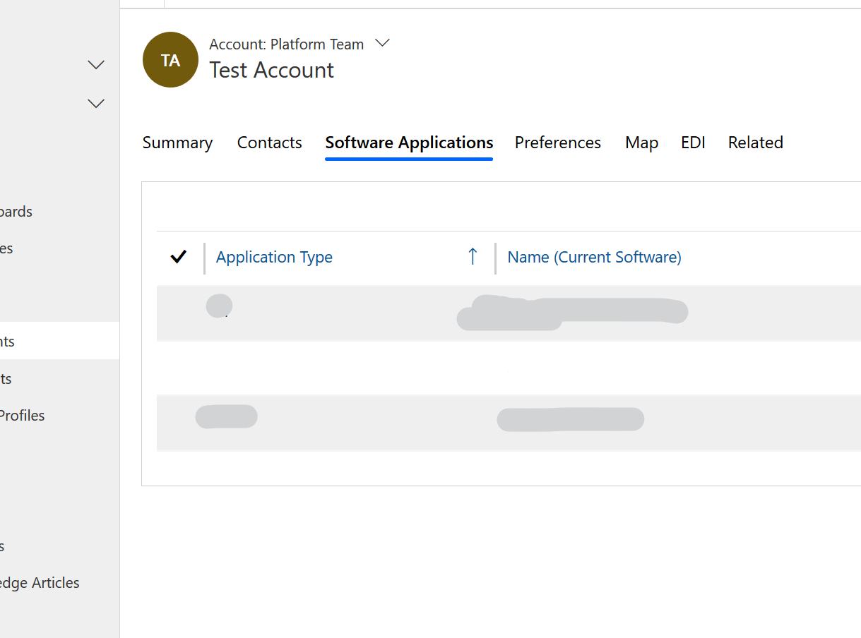
By clicking on this, it will present a list of the related entities and, when one is chosen (let’s say ‘Contacts’), it will appear as a new link within the tabs:
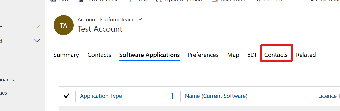
Selecting a different ‘related’ entity will update the item that’s shown rather than adding to it so, in the above example, if I was then to go back into the ‘Related’ list and select ‘Cases’, the link to ‘Contacts’ would be replaced by one to ‘Cases’.
The last point I want to raise on the subject of forms is their responsiveness. At the time of writing this blog (summer 2019), this is something I’ve been hearing a lot about recently and means that the application will, based on your screen resolution and orientation, determine how best to show the items on the form to display them in the most readable manner.
So if you’re looking at this form on a mobile device in portrait mode, you’re going to get a very thin form that’ll be quite long but if you rotate the screen back to landscape, it’s going to move some of those items so they’re side by side again. It should remove the need for horizontal scrolling and is one of the key benefits of moving to the Unified Interface as this is a feature that should now be handled much more efficiently than in previous versions.
Again, steps in the right direction...