


I remember nearly two years ago, when I first used Power BI, I created a couple of reports but quickly realised they looked similar in design/style, or I had a visualisation that was my go-to every time (spoiler: it was Table!). Are you in a similar position when writing your reports?
Whilst Power BI generously provides you with 35 out-of-the-box visualisations and many more free and paid custom visualisations available in AppSource; it’s easy to find one or two visualisations you prefer to use. However, as a report writer, you must be mindful that whilst YOU like that visualisation, is it effectively getting the point across to your audience? More than likely, the answer to this question will be “No”.
So how do we rectify this; how can we create effective visualisations that can be interpreted in the way we want them to be?
Firstly, we need to understand the story we are trying to tell; once we have identified this, it is easier to determine what type of visualisation to use. I have chosen two examples below of common data stories conveyed in reports and two examples of visualisations that can be used effectively.
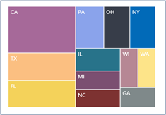
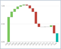
Example 1: Sales by Area Comparison
You may choose a Tree or a Waterfall.
| Tree | Waterfall |
 |
 |
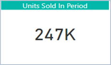
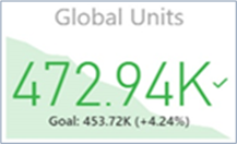
Example 2: Total Sales for the Year/Month/Week
You may choose a Card or a KPI.
| Card | KPI |
 |
 |
The above two examples convey the right message to your report viewers; they are not the only visualisation options available to you. At Tecman, we offer a training course – “Power BI - Advanced Visualisations”, which helps delegates understand reporting design principles and visualisation techniques to create clear and meaningful reports for your organisation.
If you would like to learn more about visualisations and to report design principles, please speak to your Account Manager for further information and to book on to Power BI - Advanced Visualisations course.